For those new to Dolt and DoltHub, Dolt is Git for data. Git versions files. Dolt versions SQL tables. DoltHub is a place on the internet to share Dolt repositories.
Just a bit of context#
We’ve been working on making DoltHub more mobile-friendly. A few weeks ago we made the about tab on the database page available on mobile (see blog post), more recently, we have the bounty tab available on mobile too!
I’ve been working on these mobile pages. As a junior developer, this journey is a great way of learning! Since I’ve been scouring the internet to solve some problems taking some notes, I’d like to share some lessons I learned today, and hope that they will be helpful.
Detecting devices#
We used to use next-useragent and CSS to detect mobile devices. We used next-useragent instead of window width initially because we had the a mobile warning page for the pages that are not available on mobile devices. We didn’t want people on desktop who minimize the the width of their screen to see the mobile warning, just people who are actually looking at DoltHub from their mobile devices. But since we are making the pages accessible to mobile users, we decided to switch to using the page width.
Though next-useragent helped us with showing mobile warnings, it has its own limits. When resizing the page on the desktop, next-useragent will not detect a mobile device until you refresh the page. This was not a problem for desktop users, but it was breaking our Cypress tests. When we run tests for our pages on both mobile and desktop devices, the viewport/dimensions change constantly, This causes the tests to fail since the mobile layouts are not rendering without refreshing pages.
Our solution was to use a React hook to render the window width change responsively:
export function useReactiveWidth<E extends HTMLElement>(
  elem?: E | null,
): E["clientWidth"] {
  const [clientWidth, setClientWidth] = useState(
    elem?.clientWidth ?? window.innerWidth,
  );

  useEffect(() => {
    const handleResize = () =>
      setClientWidth(elem?.clientWidth ?? window.innerWidth);
    window.addEventListener("resize", handleResize);
    return () => {
      window.removeEventListener("resize", handleResize);
    };
  });

  useEffect(() => {
    if (elem) {
      setClientWidth(elem.clientWidth);
    }
  }, [elem]);

  return clientWidth;
}
Inspecting an element on your phone#
You might be familiar with Chrome DevTools if you are a front-end developer. When debugging, I used to use the DevTools by choosing the device I want to test on. However, I noticed some pages would render differently from what it looks like on my phone. I got a CSS bug on my phone but could not reproduce it using the DevTools.
So what can I do if I want to debug by inspecting the HTML element on mobile devices?
There are two helpful tools that we can use: the Web Inspector feature on iPhones/iPads and the Remote Debugging tool for Android devices.
Take the Web Inspector feature for example. These are the steps to set up:
- Connect the iOS device to your computer.
On the iOS device:
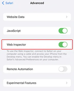
- Go to Settings > Safari > Advanced, turn on Web Inspector

- Open the page that you want to debug on the Safari browser.
On your computer:
- Launch Safari browser.
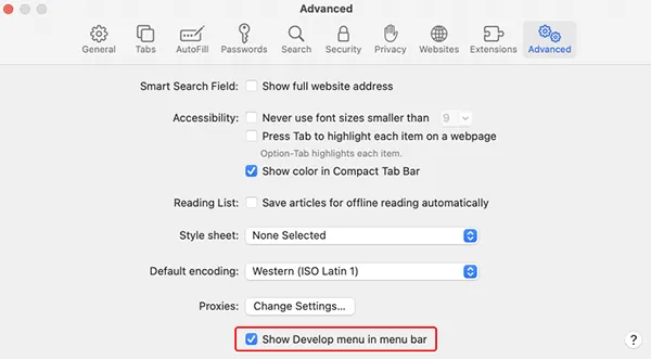
- Go to the Safari menu > Preferences > Advanced and check the “Show Develop menu” in the menu bar

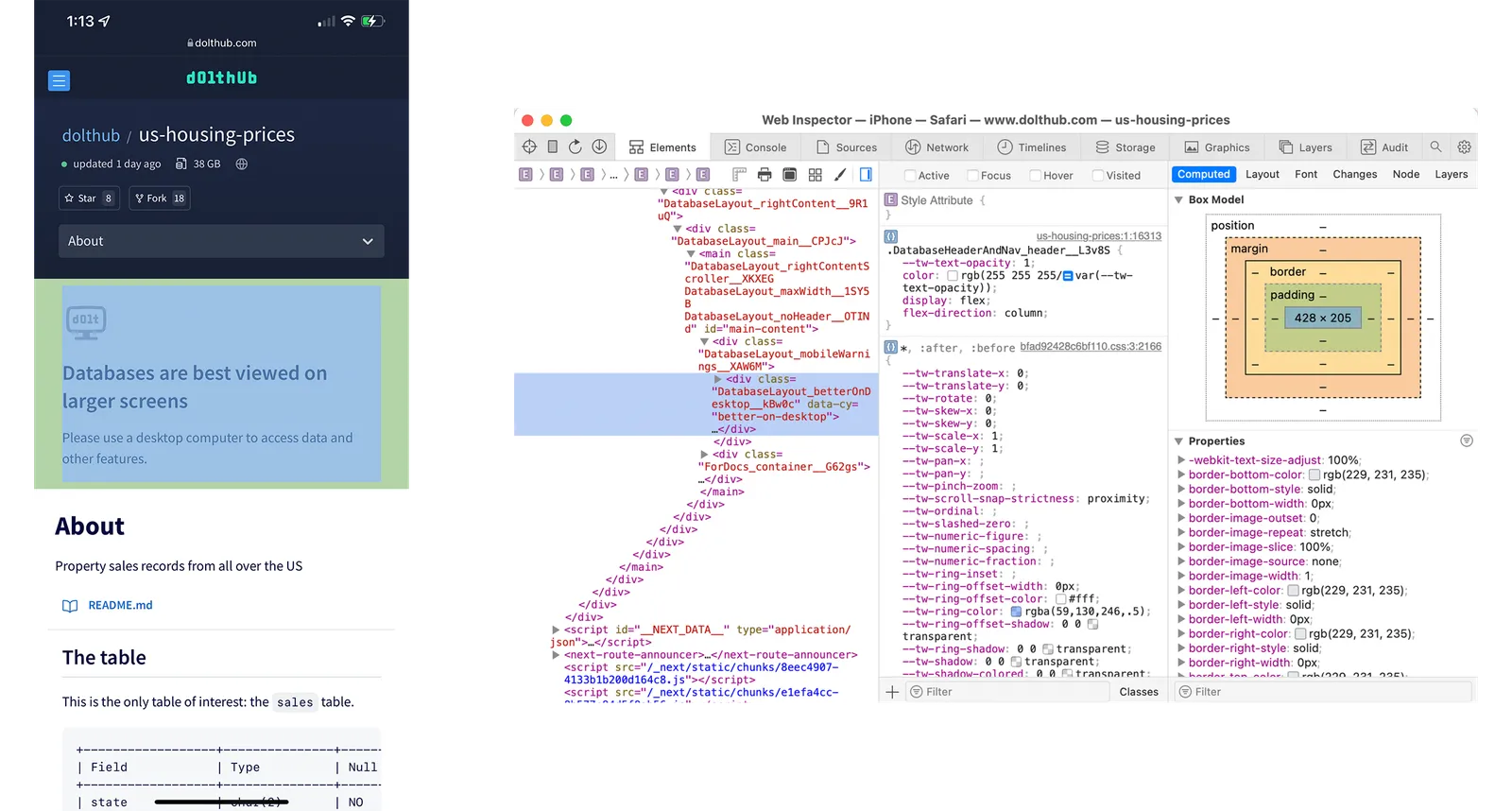
- You will see the Develop menu in the top bar. By clicking it, your connected iOS device will show up with the page URL that is opened on your mobile Safari browser.

You are all set to inspect elements on your iOS devices!

Cypress Test Improvement#
In our Cypress tests, we have a suite of tests for each page using Mocha’s bdd syntax. So, there are multiple tests/assertions in a describe block, and in each describe block, there is a it block for an assertion. If you are interested in how we test DoltHub using Cypress, we have a blog post on it.
Example of a describe block:
describe("The team page renders expected components on different devices", () => {
  describe("The team page renders expected components on a macbook-15", () => {
    it("should show the list of team members", () => {
      cy.get("[data-cy=team-list]").should("be.visible.and.have.length", 10);
    });
  });
});
So, how do we run the test suites on different devices? In Cypress, there’s a function called viewport, which sets the size and orientation of the screen for the tests. The logic is that we set cy.viewport() in the beginning of a describe block using a Mocha hook called before. This should set the viewport for each test suite. However, it does not run as we expected. The viewport will be reset to the default viewport when running each it block, which means we have to reset the viewport before every assertion. This results in a very annoying flickering between each expectation and switching viewport for every single of them is really time consuming.
Fortunately, Cypress fixed this by allowing us to add configurations in describe, which lets us persist a viewport size across a series of tests.
describe(name, config, fn);First we store the viewport height and width of each devices in a constant:
export const deviceDimensions: Record<
  Cypress.ViewportPreset,
  Cypress.Viewport
> = {
  "macbook-15": { viewportWidth: 1440, viewportHeight: 900 },
  "macbook-16": { viewportWidth: 1536, viewportHeight: 960 },
  "macbook-13": { viewportWidth: 1280, viewportHeight: 800 },
  "macbook-11": { viewportWidth: 1366, viewportHeight: 768 },
  "ipad-2": { viewportWidth: 768, viewportHeight: 1024 },
  "ipad-mini": { viewportWidth: 768, viewportHeight: 1024 },
  "iphone-xr": { viewportWidth: 414, viewportHeight: 896 },
  "iphone-x": { viewportWidth: 375, viewportHeight: 812 },
  "iphone-6+": { viewportWidth: 414, viewportHeight: 736 },
  "iphone-se2": { viewportWidth: 375, viewportHeight: 667 },
  "iphone-8": { viewportWidth: 375, viewportHeight: 667 },
  "iphone-7": { viewportWidth: 375, viewportHeight: 667 },
  "iphone-3": { viewportWidth: 320, viewportHeight: 480 },
  "iphone-4": { viewportWidth: 320, viewportHeight: 480 },
  "iphone-5": { viewportWidth: 320, viewportHeight: 568 },
  "iphone-6": { viewportWidth: 375, viewportHeight: 667 },
  "samsung-note9": { viewportWidth: 414, viewportHeight: 846 },
  "samsung-s10": { viewportWidth: 360, viewportHeight: 760 },
};
Then we set the dimensions in each describe:
describe(d.description, deviceDimensions[d.device], () => {
  runTests({ ...d, currentPage });
});Conclusion#
This change cut our test running time in half!
I hope this article is helpful! If you want to talk about ways to fix the problems above or have any questions, come chat with me on Discord! We prioritized the mobile bounty page due to a customer’s request. If you want to see a page on mobile sooner, you can also reach out to us on Discord.