DoltHub got a makeover
DoltHub is a place on the internet to host and collaborate on Dolt databases. TLDR: DoltHub provides a SQL first interface for interacting with your Dolt database.
DoltHub got a makeover! This post will detail the background, motivation and results of that transformation.
Proof of concept (2019)
Our first design was an MVP designed and implemented by our engineering team. It wasn't pretty but it worked. Having used the product internally for a while, along with some of our early adopters, we knew we were on to something. Rather than describe Dolt tooling, we could show it off. And more than that, the potential for collaboration was tremendous. Leaning into the Github workflows became an obvious value add to the Dolt ecosystem.
Improve what we built (2020)
For our second DoltHub upgrade, we hired a designer and began the trek to make DoltHub a SQL first interface. We added support for SQL queries and inserts on the web, making DoltHub the only place on the internet to not only host but query databases. In addition, we improved the database navigation, and added more features like forks and issues, and built out DoltHub API in order to support workflows like file upload and merge on the web.
Move to a SQL first interface (2021)
We now support SQL queries and inserts on the web. The motivation was simple: expose SQL capabilities on the web to lower the barrier for data entry, sharing, discovery, auditing, what have you. The better we can share, transact on and inspect databases the closer we get to the open source data community that we envision.
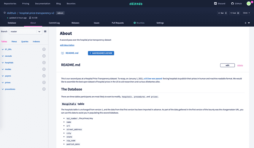
DoltHub also has a new color scheme, and separates out Dolt and DoltHub interactions via the left and top navigation, respectively. On the left panel, you'll see the contents of the Dolt database rendered, which can be used to inspect tables or queries. On the top navigation (the header that spans across the top of the page) you can route to web workflows like pull requests, issues or file upload. Check it out:
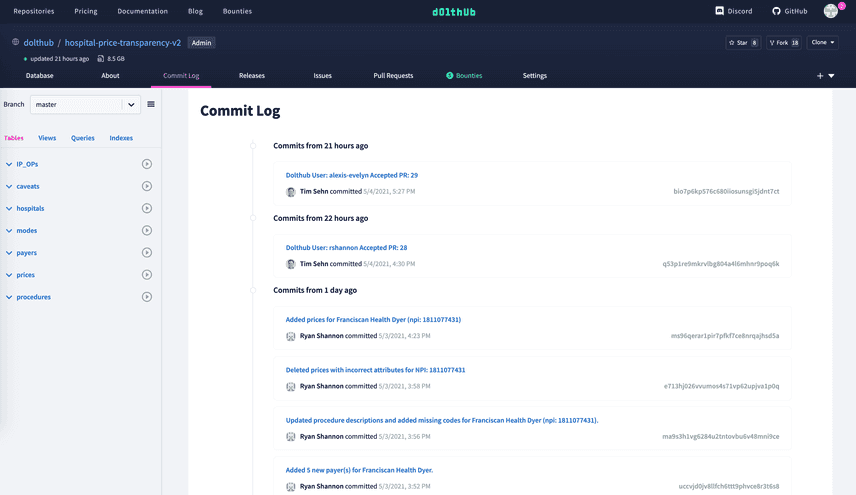
You can now view your branch, tables and queries from any route within the repository page. The following screenshot is an example of this from the commit page:
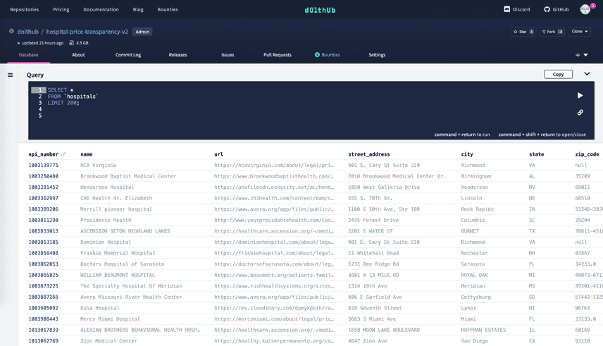
We moved the SQL console to the top of the page and made the entire query clickable in order to open the console (you can also use command + shift + return to toggle the console). The database navigation on the left panel is collapsible, allowing users to maximize the real estate of their browser to view large datasets. For example, the hospitals table in our hospital-price-transparency-v2 repository:
Honorable Mention
The repository page wasn't the only page to get a rebrand. Our homepage is also updated with a new theme and material. Go check it out and share it with your friends!
Next steps
In the next few weeks, I'll be rolling out our new navbar and designs across all DoltHub pages. During the redesign project we greatly increased our unit testing coverage (reference: A Guide To Unit Testing React Apollo Components), but decided to punt our Cypress testing until after release. It will take a week or two of part time work to get our Cypress testing back up to speed.
Conclusion
We hope you like the new repository interface. Go play with it and join us on Discord to tell us what you like and what we can improve.


